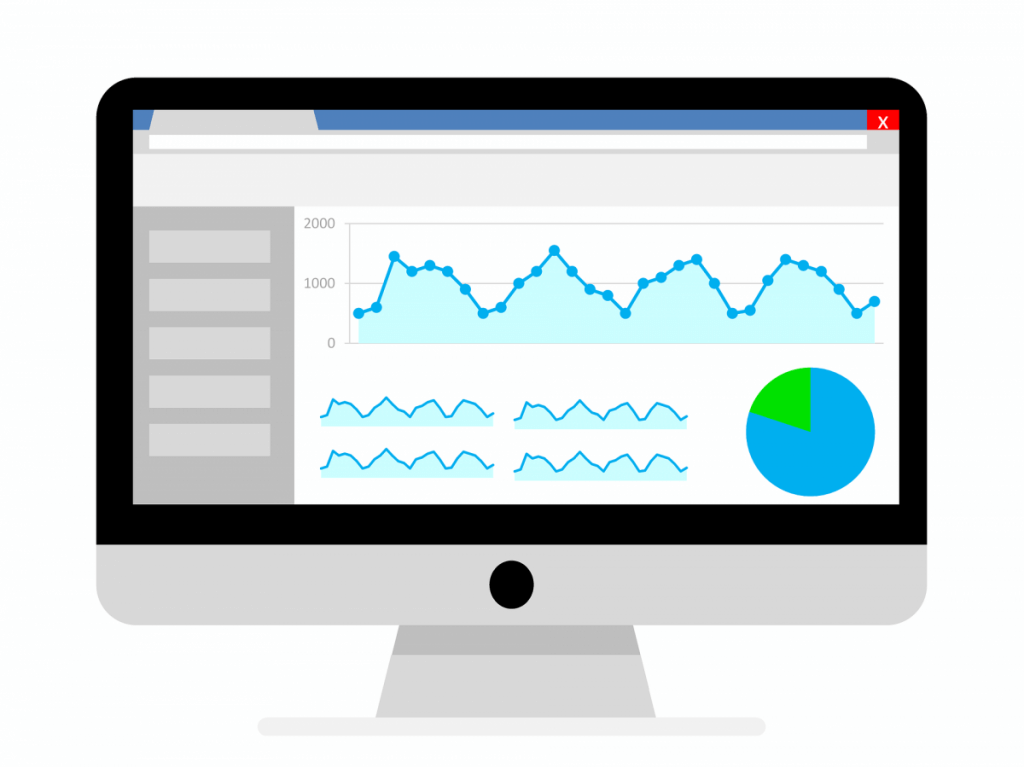
If you’ve decided to create a business intelligence dashboard, congratulations! You’ll soon be enjoying the benefits of improved reporting capabilities, in-depth analysis, and improved business insights.
But there are a few things you need to know before you begin planning your business intelligence dashboard. A dashboard won’t automatically help you make better decisions. The type of dashboard and the information within that dashboard will directly impact how helpful it actually is.
With that in mind, here are some of the most important dashboard best practices, so you can get the most out of your new business intelligence dashboard:
Use only the most important information
This is one of the most difficult parts of creating a dashboard. In order for you to actually benefit from your dashboard, you’ll need to narrow down which information is crucially important, and which is not.
The first step is to find the core or theme of your dashboard. That means it’s answering a question or helping to solve a problem.
A sales dashboard may be created around effectively moving leads through a funnel. Or a marketing dashboard may aim to display how you can improve your marketing ROI. By finding this theme, you can use logic to discard extra information.
Keep it short and simple

This also goes hand-in-hand with the best practice above. Usability should always be kept top-of-mind, and you should aim to keep all of your information consolidated. Many experts suggest that the best dashboards are kept to a single screen, for faster data understanding and inspection.
Our brains are only capable of storing small amounts of data in our short-term memories. Christopher A Sanchez published a study titled “To Scroll or Not to Scroll: Scrolling, Working Memory Capacity, and Comprehending Complex Texts.” The study found that scrolling reduced the reader’s ability to understand complex topics- particularly for those who had lower memory capacities.
Incorporate both big picture and detail
The best dashboards display high-level reports which give users an overview of what’s happening within a business. They also allow those users to drill down and see the details about why different actions occurred.
Another option is to include some information in an appendix. This satisfies the people who want “interesting” information included. But it also keeps the focus on your company’s most important data.
Support casual use
Not everyone in your business will use your dashboard every day, and you’ll also occasionally have new employees using it for the first time. For this reason, you should minimise the barrier to entry for these users. Avoid overloading them with features, and provide clear descriptions of which each graph or statistic means.
You should also allow users to compare two or more types of data side-by-side. Incorporating alerts is another way to allow employees to react to changes in real-time, increasing productivity. You may also want to add the ability for users to export and print information to take with them to meetings.
Make it customisable
One of the reasons why so many dashboards fail is because they’re not relevant to everyone. By building in flexibility, you can make it customisable. That means employees in every team and at every level of your company can adjust it depending on the data they need.
This can be achieved through the use of filters, and you can also offer easy ways for each user to highlight or tag the information that’s important to them. You may also want to make it possible for users to save a particular view of the data that they’ve configure. This allows them to always use that view whenever they use the dashboard.
Need help creating a business intelligence dashboard that will work for you and your team? We can build a dashboard that you and your team will want to use. Get in touch today to learn more.


