What is responsive web design?
Responsive Web Design (RWD) refers to developing sites able to provide optimal viewing experience an optimal viewing experience on target device – from navigating, to resizing, to scrolling – in any browser screen size provide responsive website user experience especially in smaller screens with faster load time.
Responsive Web Design has three technical components:
Responsive Web Design (RWD) utilises specific styling tools to ensure that a site responds accordingly to different browsers.
Fluid grids.
Instead of using pixels or points, for better user interface a percentage-based design is used so that the site adapts and fits the screen of the device types accordingly termed as “Fluid Layout”.
Flexible images.
The size of the images is in relative units to ensure that they display within their containing element.
Media queries.
CSS rules are applied on the page based on the characteristics of the device used to display it. Commonly, the basis is the browser width.
One good example of an existing site with Responsive Web Design is Microsoft (www.microsoft.com)
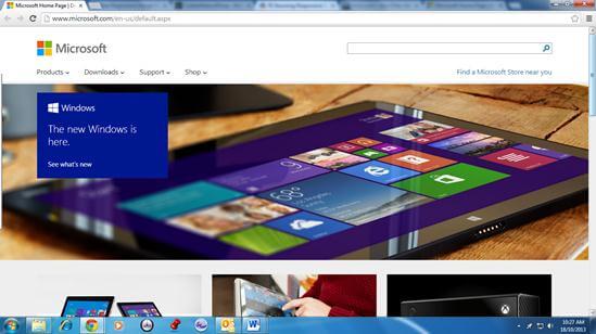
Microsoft site in maximised browser view
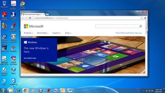
Microsoft site in restored down browser view
What is adaptive web design?
Focused on the client and not on the browser, Adaptive Website Design utilises progressive enhancement elements to establish design methods. Essentially, progressive enhancement has three layers involved in the AWD technique design requires:
- Content layer (HTML)
- Presentation layer (CSS and styling)
- Client-side scripting layer (jQuery or JavaScript behaviour)
The ability of a website to fit into predefined screen sets and devices sizes is made possible through Adaptive Web Design (AWD).
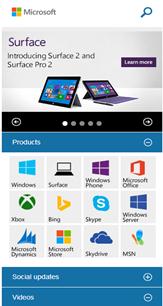
Microsoft also has its mobile website which uses an Adaptive Web Design responsive layouts view for mobile version sites.
Ph 1300 739 117 | Email [email protected]